Location
Amsterdam
Year
2025
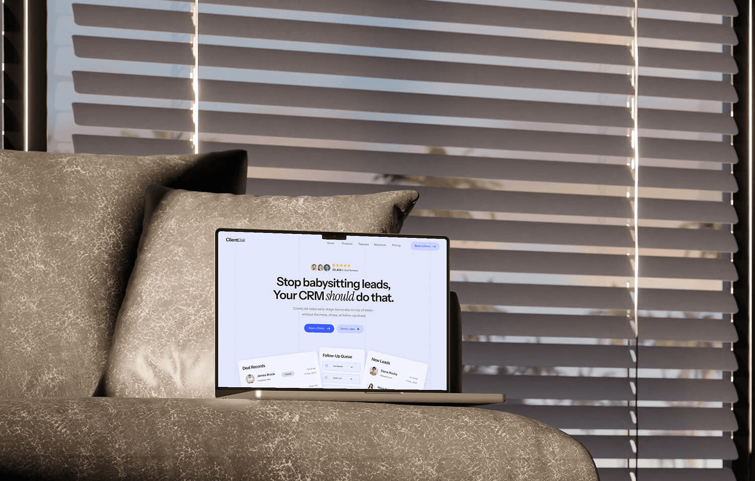
ClientLink—Approachable software marketing
Software marketing has a messaging problem: most companies lead with features that confuse instead of benefits that convert.
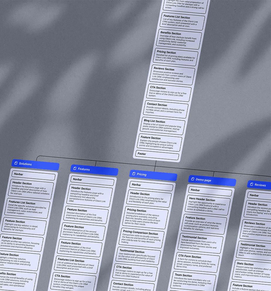
We designed ClientLink's website around a simple insight—potential users need confidence before complexity. Starting with sitemaps that prioritize value over features, we wireframed user journeys that build trust step by step.
Clear navigation, reassuring messaging, and flows that address concerns before showcasing capabilities. The result: a website that makes CRM adoption feel like an obvious choice, not a risky decision.
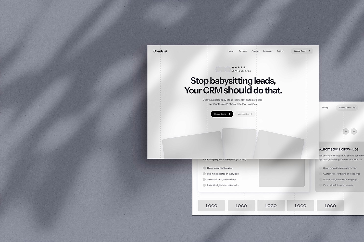

Simple visuals, complex capabilities
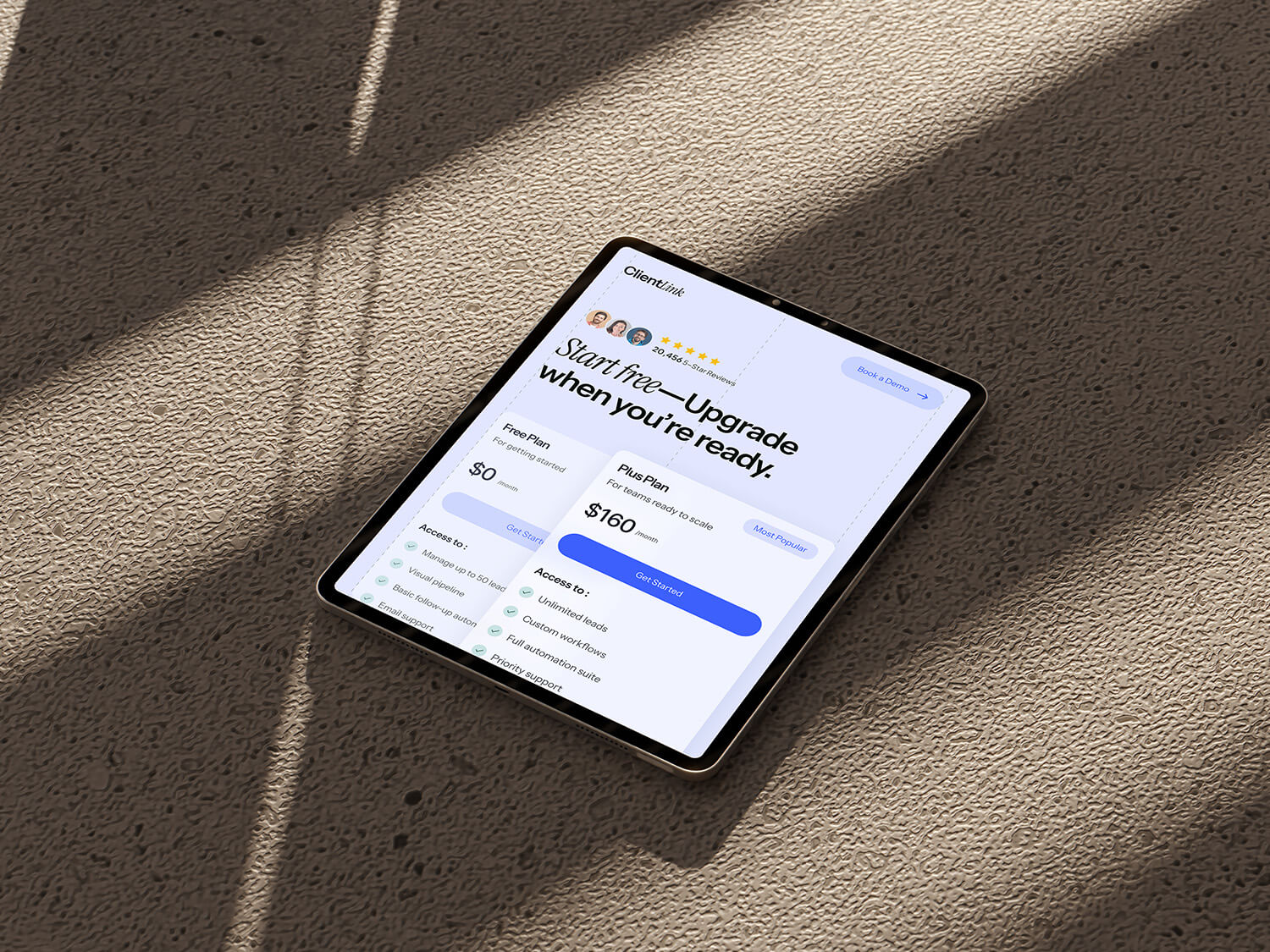
With user flows mapped for trust-building, we created visuals that prove simple doesn't mean basic. Most CRM websites feel industrial and overwhelming—we went the opposite direction with clean, premium design that makes complex software feel effortless.
We combined two complementary typefaces to add personality without sacrificing professionalism—breaking away from typical corporate software typography that feels cold and intimidating. Generous white space, thoughtful color choices, and playful yet purposeful details create an experience that invites exploration rather than causing overwhelm.


Why software websites should feel light, not loaded
This concept project demonstrates a fundamental truth about software marketing: visual weight directly impacts user perception. Heavy, feature-loaded websites make even simple software feel overwhelming and difficult to use.
Most software companies mirror their product's complexity in their website design, creating multiple barriers to engagement. The most successful ones understand that light, breathing design makes sophisticated technology feel accessible and manageable.
When your website feels effortless to navigate, prospects assume your software will be too. Ready to make your complex product feel surprisingly simple?
